← Back to portfolio
01 Cover
E-Commerce

Website
Redesign

Rebuilding the browsing controls into a cleaner, calmer shopping experience for millions of IKEA customers.

UX/UI Case Study 2026
IKEA REDESIGN
02 Problem
02The problemikea.fr · Desks · live site

Browsing fights the shopper

An audit of the live desks page: the tools people reach for most are buried, absent, or hidden behind a gesture.

01

Filter overload

~18 filter sections, all at equal weight.

02

No cart within reach

Can't open the basket while browsing.

03

No search on the page

No keyword refine, no cross-jump.

04

Nav hides on scroll

Returns only on a deliberate scroll-up.
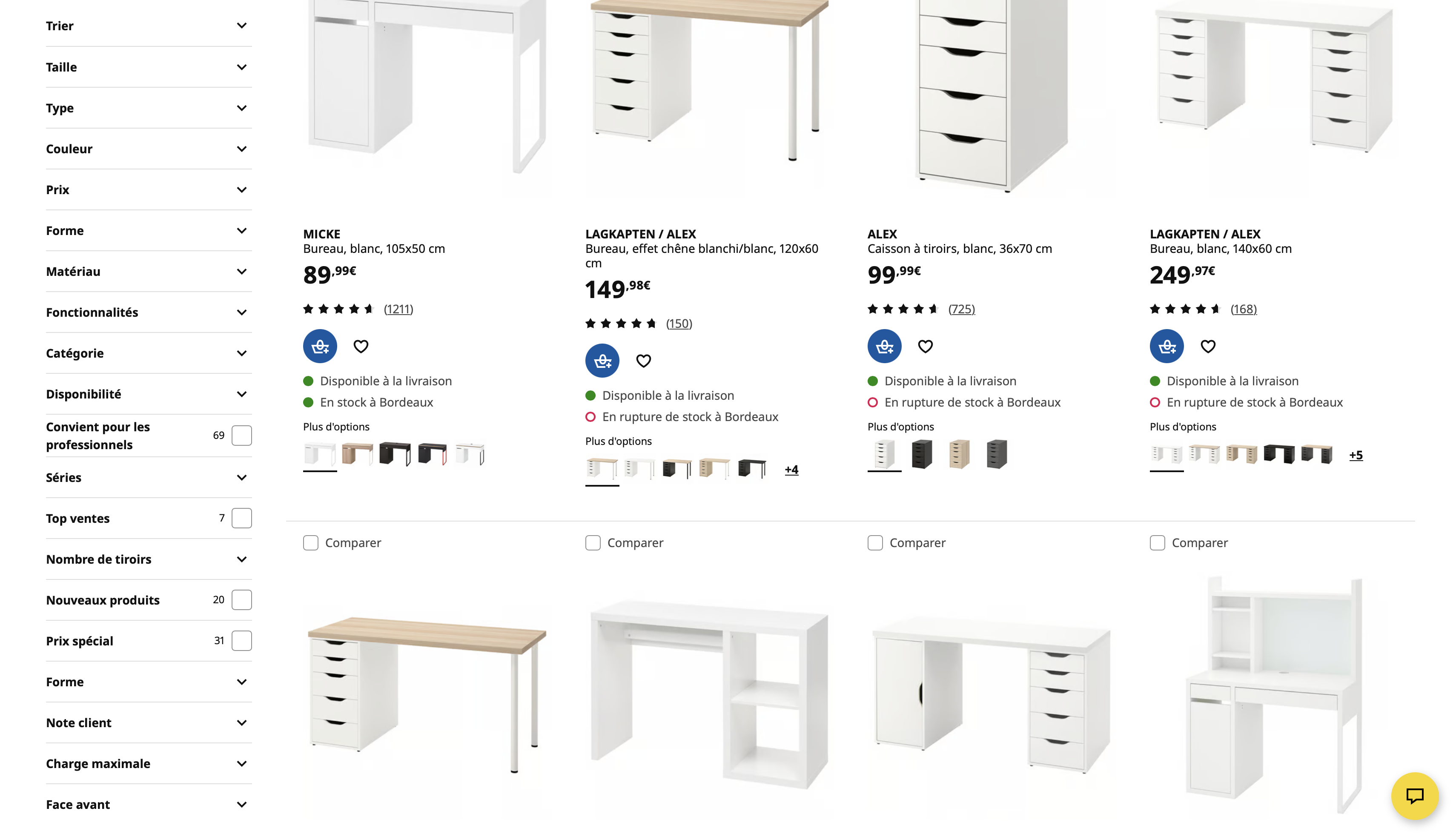
IKEA.fr desks page on the live site
03 UX Audit
03UX auditHeuristic evaluation, prioritised

Four findings, ranked by severity

A heuristic pass against Nielsen's ten. Every issue traces back to one root: the browsing controls are out of reach.

4issues found
2critical
2high

Filter overload

Aesthetic & minimalist design
Critical

No search on the page

Flexibility & efficiency of use
Critical

No cart within reach

Visibility of system status
High

Navigation hides on scroll

User control & freedom
High
04 Design Principles
04PrinciplesRestraint over reinvention

Fix the structure,
keep the soul

Four rules behind every decision. None of them touch IKEA's identity, they only change what is within reach, and when.

01

Always on, never summoned

The tools people use most stay in reach, not hidden behind a scroll gesture.

02

A shortlist, not a wall

Surface the filters people actually use; tuck the long tail one tap away.

03

State, out loud

Active filters, the result count and the cart stay visible, so nothing feels lost.

04

Bend the layout, not the brand

Every change speaks IKEA's existing visual language. No rebrand.

05 Navigation
05NavigationPersistent, not conditional

A header that never leaves

On the live site the whole bar auto-hides on scroll, so search and cart hide with it. In the redesign the navbar and filter bar stay pinned; only the top utility strip recedes.

Search Filters Cart
① At the top of the page
Scrolling down
② Scrolled, the bar holds
06 Filtering
06FilteringThe core move

A wall of 18, folded into five

The vertical rail becomes a bar of the five highest-intent filters; the full set moves one tap away into Tous les filtres, organized, not stacked.

Before · 18 sections
Trier
Taille
Type
Couleur
Prix
Forme
Matériau
Catégorie
After · 5 chips
Tous les filtres Prix Couleur Type Matériau Disponibilité
07 Product Grid
07Product gridCalm by default

Cleaner cards, one clear action

The card keeps every essential, image, price, rating and stock, but sheds the Comparer clutter. Ajouter au panier surfaces on hover and confirms right on the card.

Comparer checkbox, removed
Options folded to swatches
Add to cart on hover
Blue in-card confirm
Rating & reviews, kept
Delivery & stock, kept
08 Cart
08CartClosing the purchase loop

Close the purchase loop

The listing let you add to the cart, then lose sight of it. A mini-cart brings the whole basket into view, right where you are, so the path to checkout never breaks.

09 Craft
09CraftThe small stuff, done right

Sweating the details

Beyond the four big moves, the small touches that make browsing feel considered.

Search that predicts

Type-ahead with suggested queries and popular products, thumbnails and prices as you go.

A sort menu, not a select

A brand-styled dropdown with a blue check, in place of the native OS control.

Filters you can undo

Every choice is a removable chip, with Clear all, and the state stays visible.

An empty state that helps

No results offers a concrete fix and a one-tap reset, never a dead end.

Load more, then jump back

Progressive loading with a progress bar, and a persistent back-to-top.

Considered by default

Visible focus rings, 44px targets, and prefers-reduced-motion respected throughout.

10 Responsive
10ResponsiveBuilt for the thumb

Thumb-first, not just shrunk

The desktop model carries over: a compact sticky header, a scrollable chip bar, and the full filter set as a bottom sheet, easy to reach with one hand. All live, rendered at 430px.

ListingCompact header, chip bar, 2-up grid
All filtersBottom sheet, thumb-friendly
CartMini-cart, checkout in reach
11 Design System
11Design systemBuilt in IKEA's language

A small kit, straight from the brand

Every screen is assembled from one system: IKEA's colours, Noto Sans, and a handful of shapes. No rebrand, just discipline.

Colour
Primary#0058A3
Accent#FFDB00
InkSurfaceLineStockTop ventes
Type · Noto Sans
Aa
Display900 · -3%
Heading800
Body400 · 1.55
Foundations
Radius
pill
18
14
9
Spacing · 8-pt
4 · 8 · 16 · 24 · 32
Components
Top ventes
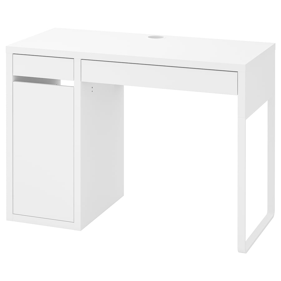
MICKE
Bureau, blanc, 105x50 cm
89.99
★★★★★(1,211)
Tous les filtres Prix Blanc ✕ Ajouter au panier Effacer 3
Icons · SVG line
Accessible by defaultVisible focus rings · 44px targets · 4.5:1 contrast · full keyboard nav · prefers-reduced-motion respected
+ Embed intro · screenshot and place above the live prototype
Live prototype below
Try it on your own
Clicking beats reading. Go on, break it.
12 Close
IKEA.fr · Website redesign

Thanks for
watching.

Mykyta Syvash
Product Designer